Letterpress
Handset metal type
Wood type
Printer’s plates
Gamblin Relief Ink on Flurry Bright White paper
Edition of 12
12” x 18”
Handset metal type
Wood type
Printer’s plates
Gamblin Relief Ink on Flurry Bright White paper
Edition of 12
12” x 18”
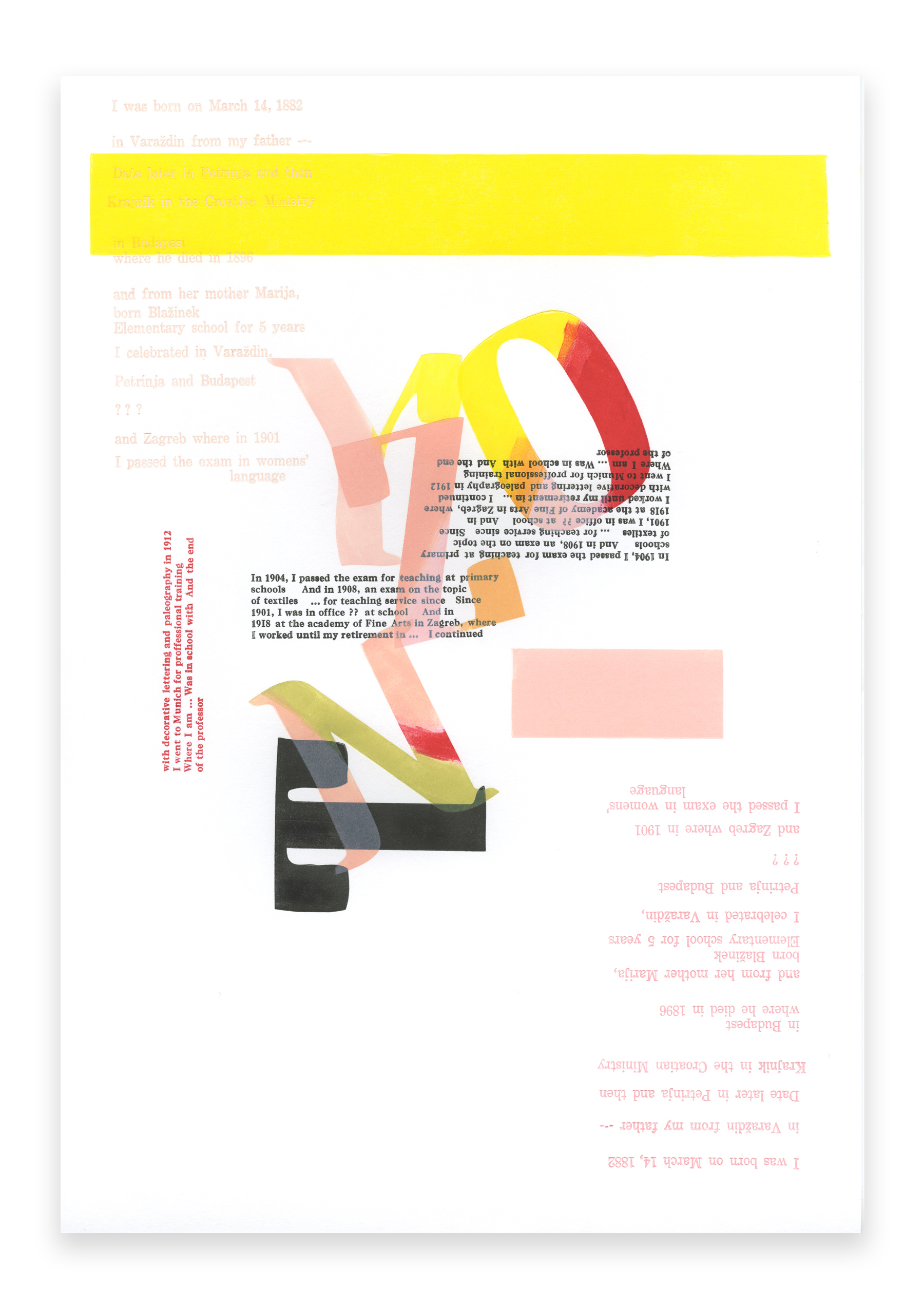
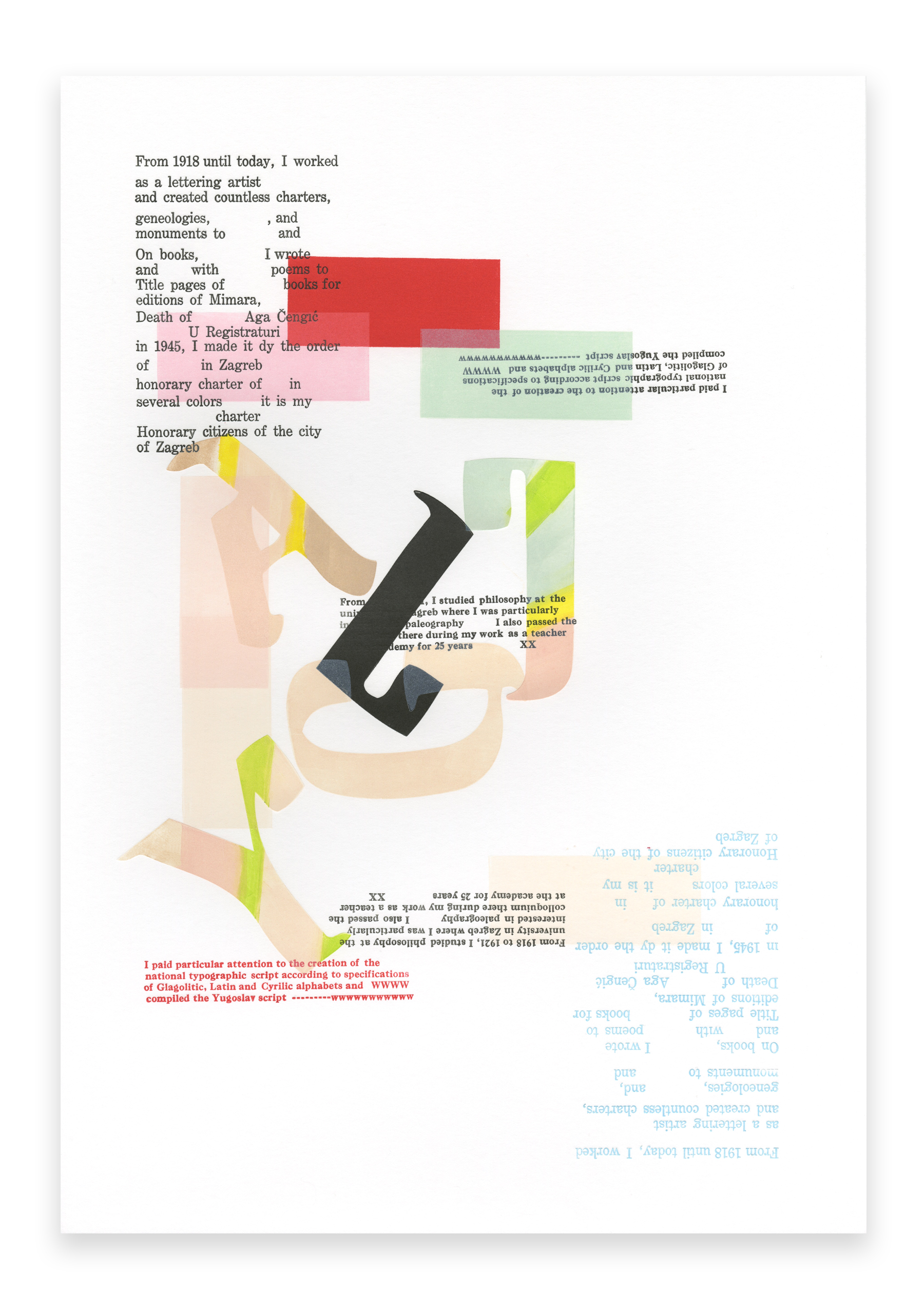
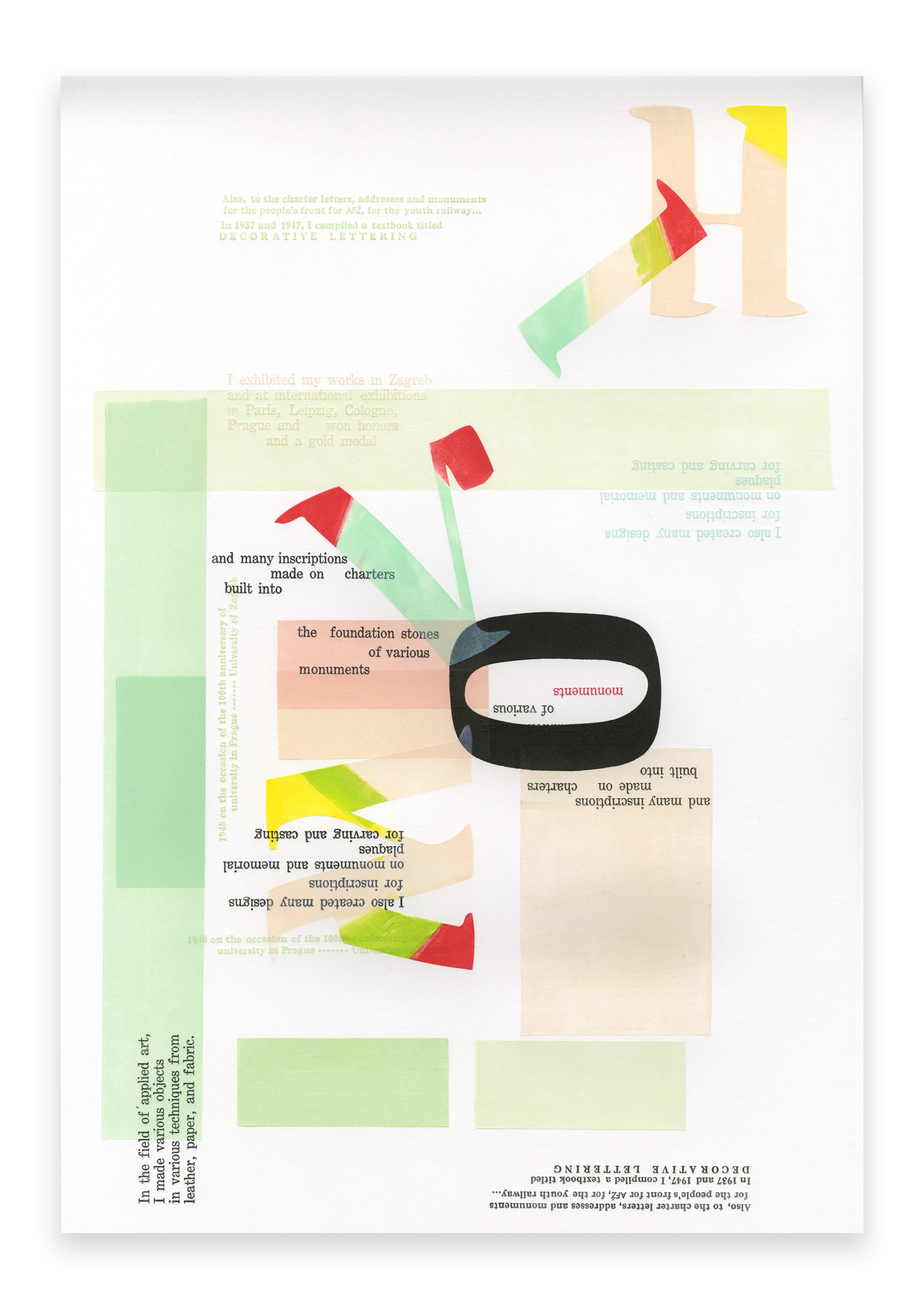
Olga broadside prints form a triptych that captures Olga Höcker’s story to monumentalize her practice. I saw the name Olga Höcker for the first time in the fall of 2016 when I came across a database of 20th-century female designers working in former Yugoslavia, the website www.dizajnerice.com.
Until then, there had been little documentation of female practitioners in the region. Höcker stood out to me as the only female typographer in the database. I was excited by this discovery because I had not known any 20th-century female typographers from the area. I was also intrigued to learn that she was born in Varaždin, Croatia, my birthplace.
Among images of Höcker’s work, I found a picture of her hand-written biography from her application to the Croatian Association of Fine Artists and Applied Artists. While it was difficult to make out some words, I could read about her accomplishments in her own words. Olga Höcker was an internationally award-winning typographer and lettering artist, author, and the first female professor at the Art Academy in Zagreb, Croatia. Nonetheless, little documentation of Höcker's practice exists today. An article written in 2012 by the art historian Lovorka Magaš Bilandžić currently serves as the only academic source of information on Höcker.
I continued my research while visiting Croatia. In 2018, I acquired a 1951 edition of Höckers handbook on paleography, decorative writing, and ornamentation. It featured a variety of original designs, including Yugoslav Script. Höcker developed this exquisite lettering based on the features of Glagolitic, Cyrillic, and Latin script, the three scripts used in the region. I was inspired by this work and created digitally rendered drawings of the letters. I modernized and simplified the glyphs and imagined the typeface used in print as a display typeface that I named Ms.Olga. This typeface is a modernized version of Höcker’s Yugoslav Script, rendered as a display typeface. My letterforms were rendered in such a way as to be particularly suited for wood-type production. In 2020, I began working with Tiporenesansa, a letterpress studio in Ljubljana, Slovenia, to create wood-type matrices based on my designs. Marko Drpić, the studio owner, cut the first production of 22-line Ms. Olga wood type using pear wood in the summer of 2021. The result is a beautifully rendered wood type that can be used for various applications.
During most of Höcker's life, letters were rendered in print as type, using letterpress printing. While her work was used in various applications, Höcker’s lettering was never designed to be cast in metal or cut out of wood as a complete font. Similarly, her biography had never been printed. I wanted to change that.
I worked on translating her hand-written biography into English. I deliberately included the gaps that made space for words that I couldn’t make out. Translation became essential to my relationship with Höcker. While translating, I kept a log of occasional mistranslations. I was interested in capturing her biography and the liminal state of silence that enveloped her life’s work, likely primarily due to her gender, as well as the turbulent political circumstances of her life and her legacy.
I set the English translation of her hand-written biography in Century Expanded and Caslon metal type, setting one letter at a time and printing her words in three broadside compositions, each printed in an edition of 12 prints. I typeset and printed the text in three broadsides, printing them one at a time and spending hours on the composition, layout, and production of the prints. The investment of time and labor informed the composition of the work.
These final three broadsides feature my English translation of Höcker’s biography, set in 10-pt, 11-pt, and 14-pt metal type. Printed next to Höcker’s biography are large, vibrant letters of my Ms. Olga typeface, printed using the 22-line wood type. This work is conceived as a celebration of Höcker’s legacy and a vehicle for documenting Höcker’s life and work in institutional archives.
2023


