

Letterpress print on
Hahnemühle
Copperplate Paper
Tryptich
12” x 19” each
Hahnemühle
Copperplate Paper
Tryptich
12” x 19” each
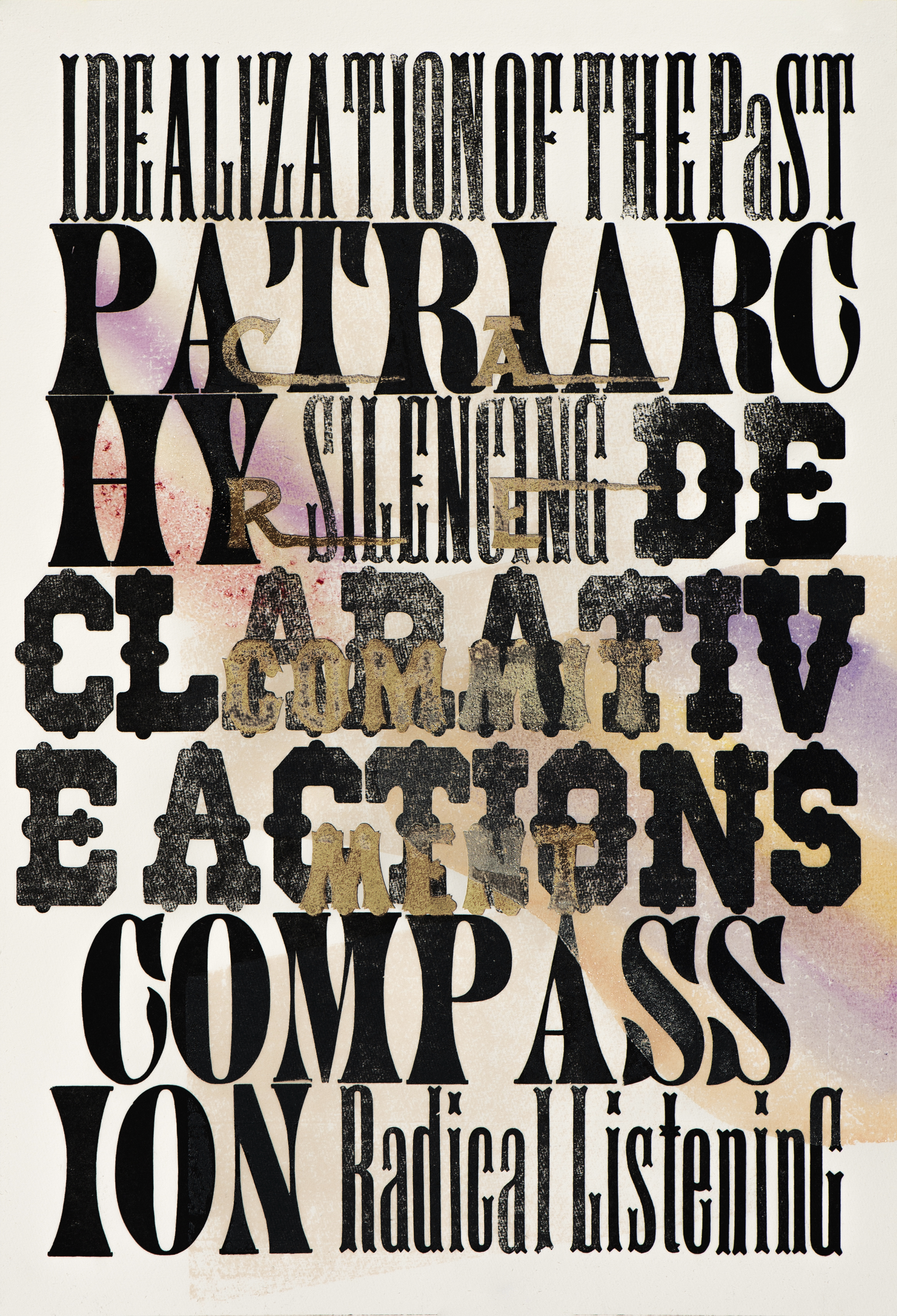
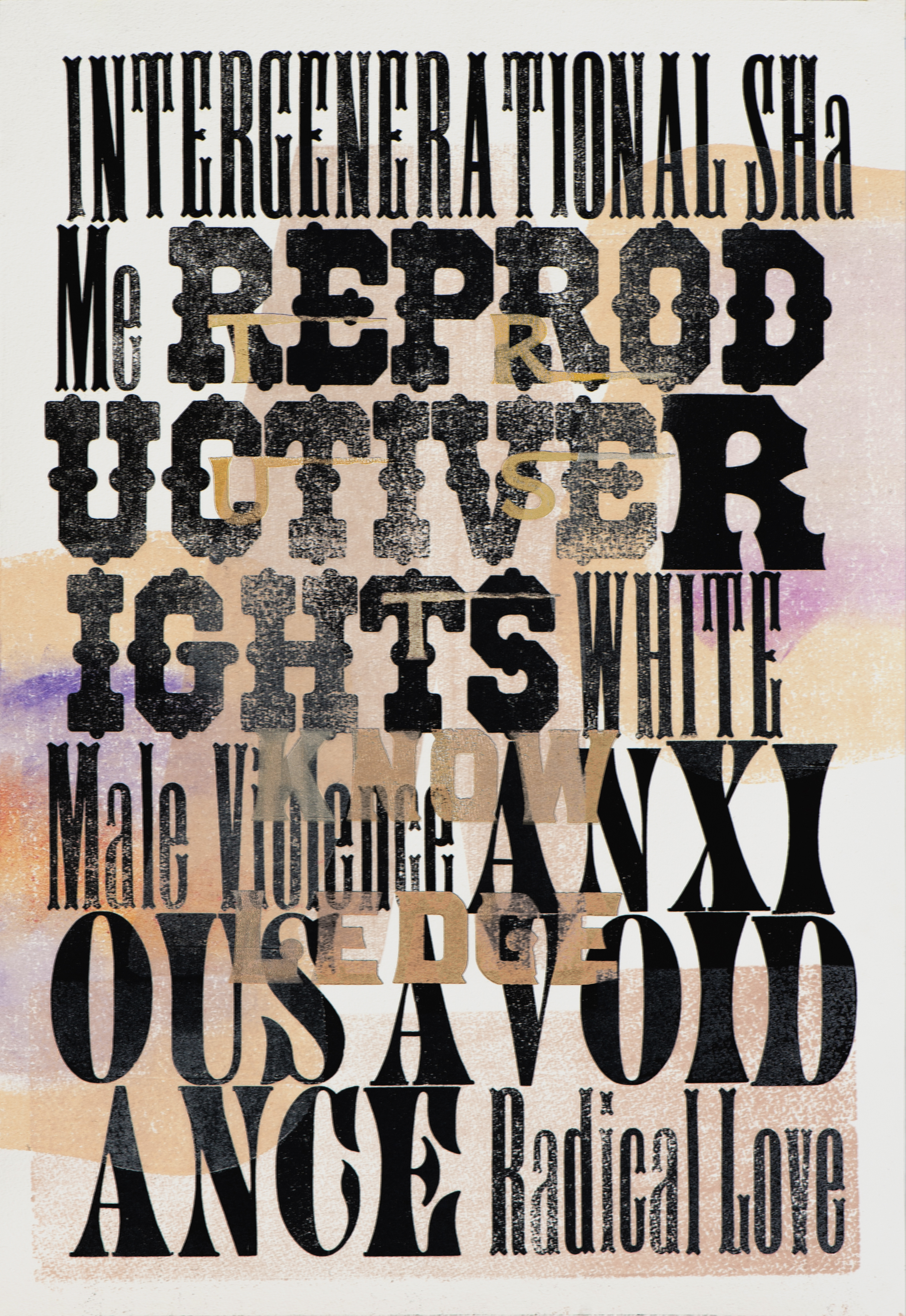
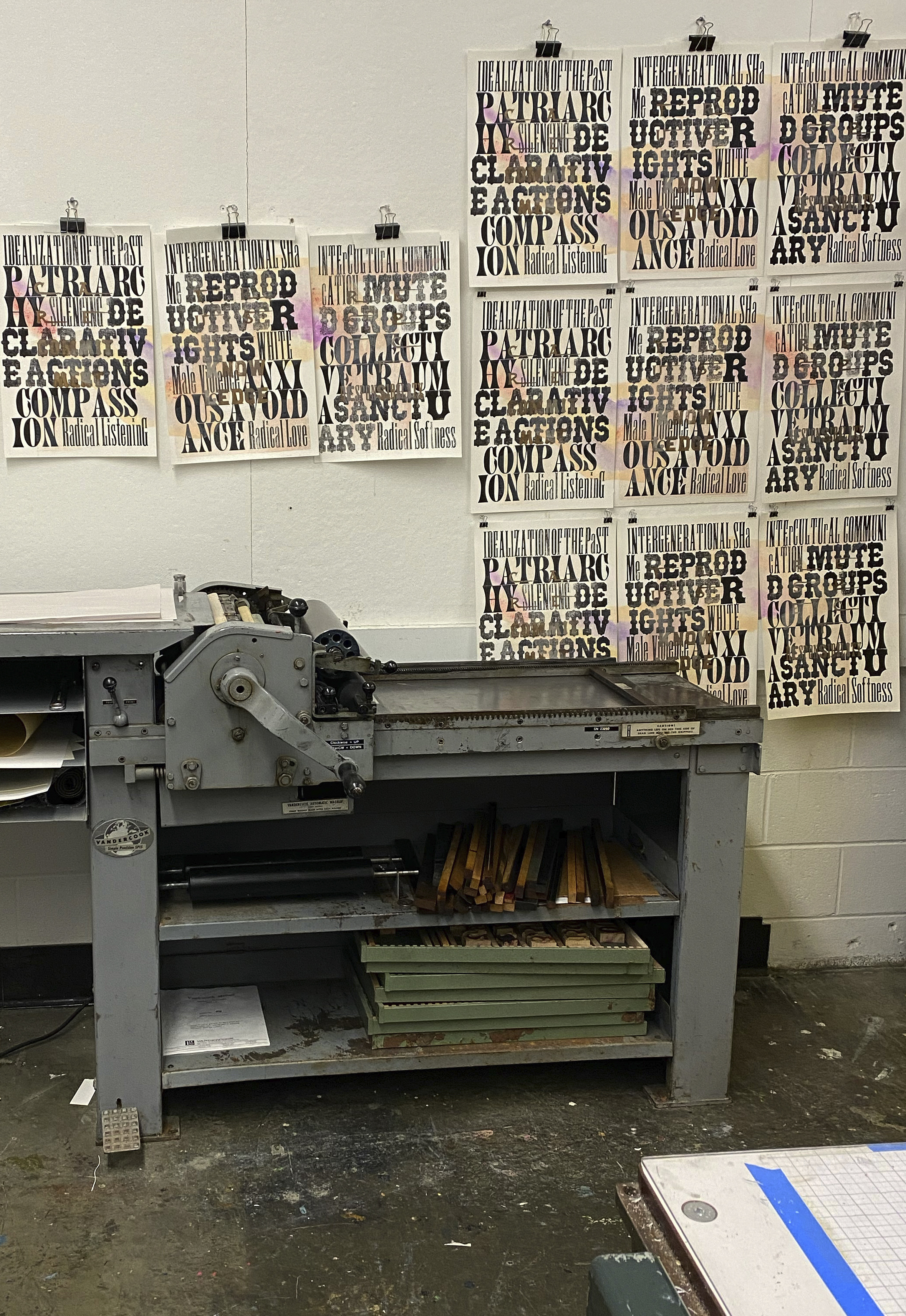
Radical is a series of three prints produced during a residency at the Rochester Institute of Technology (RIT) as a part of an invited cohort of internationally recognized artists.
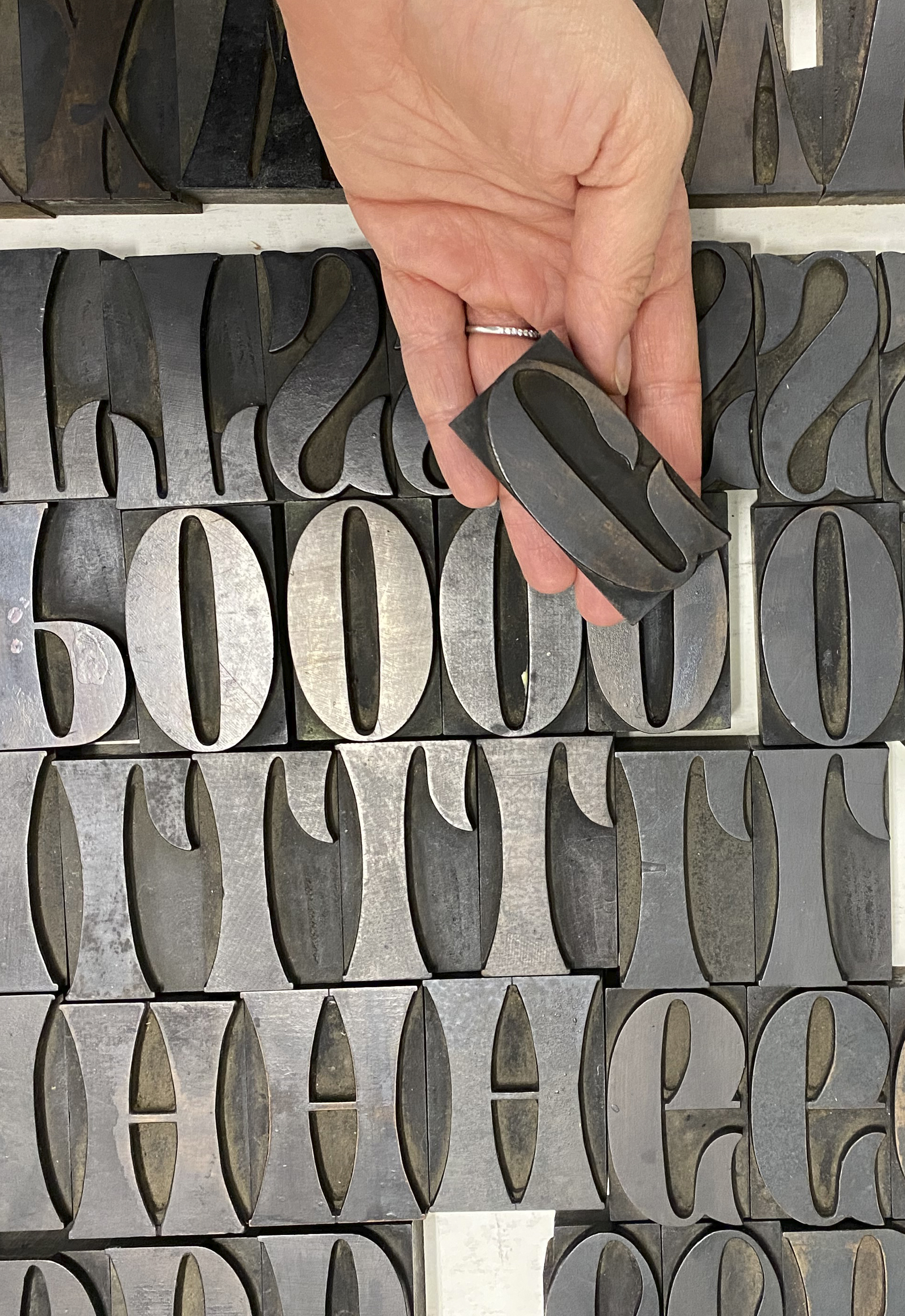
As I planned my project, I was particularly looking forward to working with rare antique wood type from RIT’s renowned Cary Graphic Arts Collection. The collection preserved some of the world's most unique 19th-century printing type. Having seen images of the printed type, I was excited to handle these historical objects and be the first in a long time to print them. In preparation for my arrival at RIT, I worked with Amelia J Hugill-Fontanel to review the wood type. I identified nine rare ornamental typefaces, mainly Tuscan typefaces, to use in my prints. Planning my layouts, I chose four 15-line typefaces and four 8-line typefaces. Additionally, I decided on one 6-line typeface that I had long admired in typographic specimens and was excited to be able to handle in-person - 6-line ornamented Hamilton No. 227. A complete list of typefaces used is included below.
These objects were manufactured in the mid and late 1800s and immediately conjured up the era. Letterforms live in our memory, inextricably tied to how they were used in the past. Type is often used to convey a specific time visually. For example, similar Tuscan typefaces were used in Hollywood productions, such as in the opening credits of the profoundly problematic movie Gone With The Wind, to convey a sense of the civil war era. The aesthetic qualities of letters immediately recall our complex and violent shared histories. I wanted to explore these visual inferences in my prints. As for the written content, I left it open, presupposing that I will be writing once I arrive at RIT.
I arrived in Rochester, NY, on May 15, 2022. As it happened, the day before my arrival, a mass shooting had occurred in a Buffalo grocery store, only 80 miles away, in which thirteen people were shot, ten of them fatally. The extreme, racially motivated hate crime produced a visceral shock that rattled the community. I felt that my prints had to be responsive to the community. Talking to RIT students, I reached for the writings of the Genderfail project, Lora Mathis and Paulo Freire, in my research, forming the words of our traumas and our visions. Only months earlier, we had lost a powerful voice in bell hooks, who wrote: “Love is a combination of care, commitment, knowledge, responsibility, respect, and trust.” In the face of violence, I printed in absolute hope, her powerful words in gold. The three prints are conceived as a set, with abstract patterns connecting one print to another. They were printed in an edition of fifty each and are intended to be displayed in a repeating grid, constructing a large-scale installation with an asserting presence created through repetition.
The triptych is included in the permanent collection of the Cary Graphic Arts Collection at Rochester Institute of Technology. An additional tryptich is included in the RIT Art Collection.
----------------------
Complete list of typefaces used from "A Specimen Portfolio of Wood Type in the Cary Collection,”
a 325-page typographic specimen published by the RIT Cary Graphic Arts Press:
6 line [Ornamented] cf. Hamilton: No. 227. — Pg. 291
Manufacturer and date unknown
4.07.03.01
8 line [Antique Tuscan] No. 10. ——— Pg. 215
William h. Page & Co., 1859 or later
4.07.02.01
8 line [Gothic Tuscan] cf. Hamilton: No. 20. ——Pg 213
Manufacturer and date unknown
4.06.04.02
8 line [Antique Tuscan Condensed] cf. Hamilton No. 321 —— Pg. 207
Manufacturer and date unknown
4.04.03.01
8 line No. 514
Hamilton Manufacturing Co., 1891–1906 —— Pg. 183
4.06.02.03
15 line [Tuscan Extra Condensed] cf. Page: Antique Tuscan No. 9. — Pg. 203
Manufacturer and date unknown
4.01.02.01
15 line No. 2158
American Wood Type Co. (Conn.), after 1885. —— Pg. 23
4.07.01.01
15 line No. 515. —— Pg. 211
William h. Page & Co., 1887–1891
4.03.05.11
15 line [Antique Tuscan] cf. Page: Antique Tuscan Condensed
Manufacturer and date unknown —— Pg. 161
May 2022